The top bar, hero calls to action, and supporting prompts all began feeding the same larger form experience. The larger aim was to make the brand feel lived-in, visual, and ready for a real audience rather than an early sketch.
That matters because a domain sale should feel coordinated, not split between too many weak contact options. Each note in this journal marks one more way the BajaTrails voice became clearer, from route language and pacing to visual atmosphere and the invitation to explore.
Buyers now move from interest to action in fewer clicks and with less ambiguity. That steady refinement is what gives the site more depth than a one-day launch page.
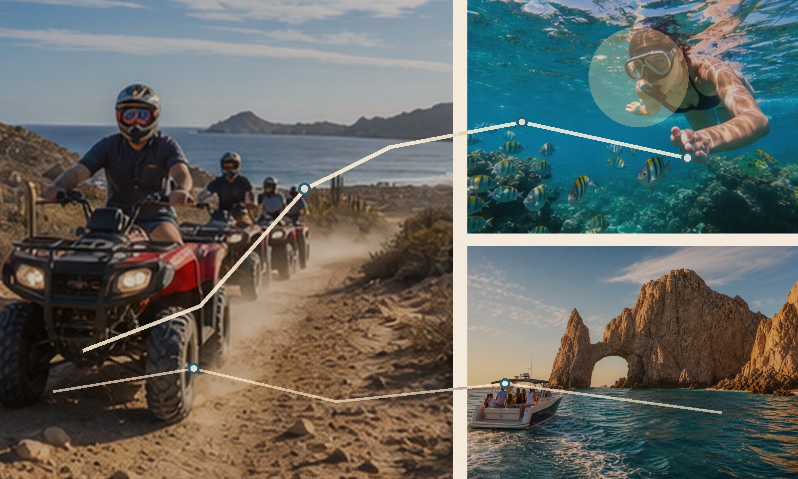
- Focus: route culture, visual direction, and brand clarity.
- Audience: travelers, creators, operators, and buyers with a feel for Baja.
- Effect: a more immersive name with more room to grow.
Together these notes sketch the kind of voice, pace, and sense of scale the BajaTrails name can carry over time.